|
|
< Day Day Up > |
|
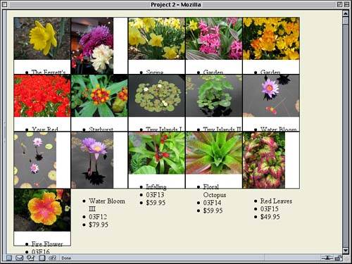
Creating the Contact Sheet ViewAt this stage, we can see the document structure itself: images followed by unordered lists. What we're after at this point is the creation of a "contact sheet" layout, in which the images are all laid out in a grid. This will let us see as many images as possible at once. Floating AwaySince we aren't using a table, the obvious solution is to float the images. We know the images are no more than 128 pixels wide or tall, so we'll make our divs 128x128 and give them a white background and black border. Speaking of borders, we want to get rid of the blue link-border around the images as well. Border Incidents
div#footer {clear: both; padding-top: 3em;

  font: 85% Verdana, sans-serif;}

div.pic {float: left; height: 128px; width: 128px;

  background: white;

  border: 1px solid black;}

div.pic img {border: none;}

</style>
Figure 2.2. Floating the picture divs.
We've already taken a huge step toward our contact sheet, but there's an obvious problem梩he lists! Because we forced the divs to be a specific height, there isn't enough room for the lists, so they're spilling out of the divs and generally messing up our layout. We need to get rid of them for now, so we'll remove them from the display routines. Explorer Watch
div.pic img {border: none;}

div.pic ul {display: none;}

</style>
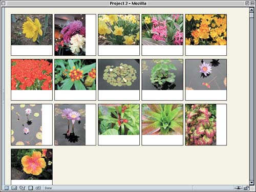
This will keep the information from being displayed at all. We'll bring back the lists in future changes to the styles, but for now we'll just get rid of them. Spacing and CenteringThanks to the floating, we now have our images forming a grid, but it feels a little too confined. Let's spread out the pictures a bit by adding margins to the floats.
div.pic {float: left; height: 128px; width: 128px;

  margin: 5px 3px; background: white;

  border: 1px solid black;}
Because margin floats don't collapse together, the actual spacing between two floats sitting next to each other will be 6 pixels (3px + 3px), and there will be 10 pixels between a float and the one below or above it. This can be adjusted to whatever spacing one prefers, of course. What we have so far is shown in Figure 2.3. Figure 2.3. Spreading the thumbnails apart.
It's getting better and better, but the images look kind of weird as they are now, either up against the top of the box or against the left edge. They'd look much better centered within each box. To do this, we should first define the size of the images. We can do this with two simple (and very similar) rules.
div.pic img {border: none;}

div.ls img {height: 96px; width: 128px;}

div.pt img {height: 128px; width: 96px;}

div.pic ul {display: none;}
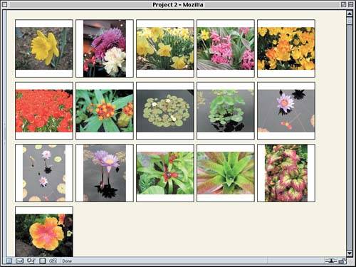
All we've done here is express what we already knew to be true but the browser didn't: that landscape (ls) images are 96 pixels tall by 128 pixels wide and portrait (pt) images are the other way round. Recall that our divs have been defined as 128x128 pixels. Now all we need to center the images are some margins on the images themselves. The difference between 128 and 96 is 32, and half of that is 16. Therefore, landscape images will need 16px of top and bottom margin, and portraits will need 16px of left and right margin. The result is shown in Figure 2.4.
div.ls img {height: 96px; width: 128px; margin: 16px 0;}

div.pt img {height: 128px; width: 96px; margin: 0 16px;}
Figure 2.4. Centering the thumbnails.
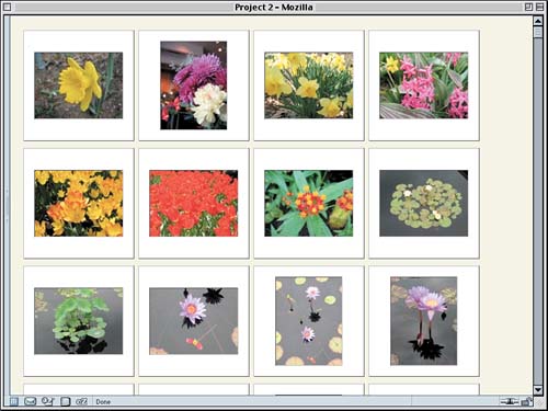
Sliding into StyleThat's already a decent layout, but let's take it a little further. Let's add some extra padding to the divs so that the thumbnails have white all the way around. We'll stick with our powers-of-two motif and add 16 pixels of padding.
div.pic {float: left; height: 128px; width: 128px;

  padding: 16px; margin: 5px 3px; background: white;

  border: 1px solid black;}
At this point, the contact sheet is beginning to resemble a collection of 35mm slides, so let's run with that idea. First we'll add a border back onto the images, one that makes them look like they've been inset into a slide frame. Another Approach
div.pic img {border: 1px solid;

 border-color: #444 #AAA #AAA #444;}
These changes give all the images a dark gray top and left border, with a light gray right and bottom border. That's a decent enough inset effect. However, there's a subtle imbalance that's been introduced by this rule. The images plus the borders are now longer than 128x96 pixels and vice versa; now they're 130x98 pixels because the borders are added to the height and width of the images. To address this, we'll need to alter the height and width declarations for the divs as well as the padding.
div.pic {float: left; height: 130px; width: 130px;

  padding: 15px; margin: 5px 3px; background: white;

  border: 1px solid black;}
With these small changes, we've restored the balance we had before. To finish the effect, let's create an outset effect for the border of the divs. All we need there is the same colors we used for the inset effect, except reversed.
div.pic {float: left; height: 130px; width: 130px;

  padding: 15px; margin: 5px 3px; background: white;

  border: 1px solid; border-color: #AAA #444 #444 #AAA;}
Note that we removed the keyword black from the border declaration. It isn't needed any longer thanks to the border-color declaration, so to save on file size, it was taken out. We can see the result in Figure 2.5. Figure 2.5. A sheet of slides, or something very much like it.
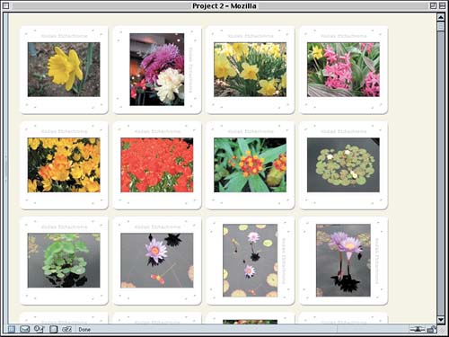
That's pretty close to looking like 35mm slides, but we can take the effect even further. Instead of relying on background color and borders, we can remove those and use a background image instead. How? We already know the dimensions of the divs once all is said and done: They're 162x162 pixels. For example, landscape slides have the following dimensions along the horizontal axis: 128px img width + 2px img border + 30px div padding + 2px div border = 162 pixels total Since we're going to be removing the borders on the divs, we can knock those off, leaving us with 160x160 pixels. Therefore, we'll make the background images for the divs that size. Because we have two kinds of images (portrait and landscape), we'll need two different backgrounds. We'll call them frame-pt.gif and frame-ls.gif. Whether they're created by scanning actual 35mm slide frames or by creating facsimiles in Photoshop is irrelevant. All we need is something that looks the part.
Once we've created the background images we need, all that remains is to add them to the styles. We'll start by applying the same image to all the divs, as well as removing our border styles.
div.pic {float: left; height: 130px; width: 130px;

  padding: 15px; margin: 5px 3px;

  background: url(frame-ls.gif) center no-repeat;}
This is great for the landscape thumbnails, but it will look weird when applied to the portrait images. So we just substitute the image we want used for portrait thumbnails with a short rule.
div.pic {float: left; height: 130px; width: 130px;

  padding: 15px; margin: 5px 3px;

  background: url(frame-ls.gif) center no-repeat;}

div.pt {background-image: url(frame-pt.gif);}

div.pic img {border: 1px solid; border-color: #444 #AAA #AAA #444;}
This will override the background image value while leaving the other keywords (center no-repeat) alone, making the declaration background-image: url(frame-pt.gif) functionally equivalent to declaring background: url(frame-pt.gif) center no-repeat. Figure 2.6 illustrates the result. Figure 2.6. Now it really looks like a bunch of slides!
That's a pretty nifty effect, eh? The great thing is that you can substitute the "frame" background with a better one later on just by updating the image files. Listing 2.1 shows the slide-collection style sheet we've created in its entirety.
Listing 2.1. The Complete "Slides" Style Sheet
body {background: #EED; margin: 1em;}

div#footer {clear: both; padding-top: 3em;

  font: 85% Verdana, sans-serif;}

div.pic {float: left; height: 130px; width: 130px;

  padding: 15px; margin: 5px 3px;}

  background: url(frame-ls.gif) center no-repeat;}

div.pt {background-image: url(frame-pt.gif);}

div.pic img {border: 1px solid; border-color: #444 #AAA #AAA #444;}

div.ls img {height: 96px; width: 128px; margin: 16px 0;}

div.pt img {height: 128px; width: 96px; margin: 0 16px;}

div.pic ul {display: none;}
|
|
|
< Day Day Up > |
|