|
|
Passive Assistance MechanismsPassive assistance mechanisms include all the clues, pointers, and explanations that you embed in the user interface to guide users in their tasks. Unlike reactive assistance mechanisms, passive assistance mechanisms don't require users to do anythinghence the name. Control labels, menu names, and even the titles of your forms and dialog boxes are passive assistance mechanisms, and therefore you should give due consideration to how you name these elements. Choose names that describe as clearly as possible the action to be performed or the data to be entered. In addition to names, many other passive mechanisms are available. We'll examine just three: mnemonic access keys, ToolTips, and status bars. Mnemonic Access KeysMnemonic access keys provide both direct functionality and passive assistance to users. Because they allow users to navigate through the system quickly, access keys provide direct functionality. Because they are always underlined in control labels, access keys also provide passive user assistance. Any user with even moderate experience with Microsoft Windows will be familiar with the "Alt-underlined character" paradigm. You should provide mnemonic access keys for all menu items and all controls. Choose which letter to use as the access key in the following order of priority:
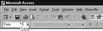
Defining access keys is trivial to do in both Access and Visual Basic: You precede the access key character in the label with an ampersand (&). In both environments, the system will underline the character in the label and handle the navigation for you. (To display an ampersand character instead of an underlined character in a label, by the way, you use two ampersands. "Nuts & Bolts" will be displayed as "Nuts_Bolts", but "Nuts && Bolts" will be displayed as "Nuts & Bolts".) ToolTipsThe ToolTip for the Save button on the Access Form View toolbar is shown in Figure 21-2. The principle behind ToolTips is straightforward: They function as labels for toolbar buttons and other controls that don't have labels. Figure 21-2. ToolTips Indicate the Purpose of Controls that Don't Have Labels
Not terribly exciting, is it? But unexciting and straightforward as ToolTips might be, their impact on the usability of the system is immense. If you've ever had to choose icon images to represent system functionality, you know how difficult it is for an icon to convey information. Choosing an icon for "Save" isn't too hard (at least it isn't now that we've all seen the disk icon used in Microsoft Office), but what about an "Open Customer Form" button? You might use a little figure, but what if you also need images for opening the Employees and Vendors forms? Your visual metaphors can get a little tenuous. Fortunately, ToolTips take off a lot of the pressure to find a self-explanatory icon. Given half a chance, most people are pretty good at making up little stories to associate an image with an ideathat's the principle behind one method for remembering people's namesand ToolTips give them that half a chance. So you're using the little fish icon in Access to represent Customers. (What did Access designers have in mind?) That a fish represents the Customers form is never going to occur to users the first time they see your toolbar, but the ToolTip will explain the icon's meaning. Provided you reinforce the association by using the image everywhere customers are referencedthe menu, the forms, and the documentationusers will adjust with no problems. To implement ToolTips in either Access or Visual Basic, you simply set the appropriate property. The ToolTip text should be shortjust a word or two. Remember that the ToolTip functions as a label: Its purpose is to remind users of what the control represents, not to teach them how to use it. If the control duplicates a menu item, use the same word or phrase in the ToolTip as in the menu item. If the control doesn't duplicate a menu item, use the noun or verb that best describes the control's functionality and distinguishes it from other controls. If a toolbar contains three buttons that open the Customers form, Suppliers form, and Employees form, for example, you could use the ToolTips "Customers", "Suppliers", and "Employees". If, on the other hand, one button represents opening the Customers form and a second button represents printing a customer list, you would need to use the ToolTips "Open Customer Form" (or perhaps "Maintain Customers") and "Print Customers" to distinguish between the two buttons. A note on images: In associating images with ideas, as in all other areas of user interface design, consistency is critical. Each image that represents an entity in the system should be used wherever your system references the entity, as should each image associated with a verb. Best practice is to select a range of images for each categoryentities and verbsand combine images from the two categories where necessary. If I were to associate an X image with the delete action, and a person's profile image with the Customers table, for instance, I would superimpose one image on the other to indicate "Delete Customer," as shown in Figure 21-3. Figure 21-3. Combining Images Can Be Very Expressive
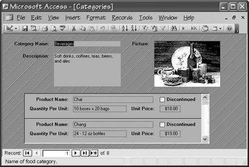
Status BarsA status bar is a common mechanism for providing passive assistance to users. Displayed at the bottom of the window, a status bar can display modal information such as the state of the Num Lock key, the Caps Lock key, and the extend selection mode. The status bar also displays messages for users. Figure 21-4 shows an Access status bar. Note that the Categories form is maximized, so the status bar at the bottom of the window appears to be part of the form. However, the status bar is actually part of the Access window itself. Figure 21-4. The Status Bar Is at the Bottom of the Main Window
Access makes it easy for you to display descriptive information in the status bar for each control on a form by setting the control's StatusBarText property. If you don't explicitly define the StatusBarText property for a control bound to a field, that field's Description value (which you specify in the table's Design view) will be displayed in the status bar. You can't, to the best of my knowledge, set the status bar text from code in Access, however, so there is no way to use status bar text for an extended description of a menu item or for general messages to users. In Visual Basic, you control the text displayed in a status bar by explicitly setting the Text property of the appropriate panel of a StatusBar control. You can therefore use the status bar to display explanatory messages throughout the system, not just to describe the active control as in Access. A trade-off for this additional flexibility is that you must always set the text in code, and there is no way to tie text to a control and have Visual Basic display it automatically. Admittedly, this extra work can get tedious, but it's a fairly small price to pay for the expanded functionality. The greatest advantage of a status bar is that it doesn't intrude on users. Unlike a message box, the status bar doesn't capture keyboard input or require explicit user dismissal. In fact, in Access (and Visual Basic as well, if you provide the functionality) a user can choose not to display the status bar. In Visual Basic, you can use the status bar to display extended descriptive information to users or to keep them informed about processes that are operating in the background. You can also use the status bar to display error messages, although you must allow for the possibility that users won't have the status bar visible. It's dangerous to use status bar text for anything users must see. Even if the status bar is visible in the main window, users might not notice a message displayed there. Displaying messages in the status bar does have its uses, however. If, as I recommended in Chapter 19, you suspend rather than reject records that violate integrity constraints, the status bar is a good place to explain the situation and how to resolve it. I sometimes display the "problem" field contents in red, and when the user selects the field, describe the problem in the status bar and suggest how to fix it. Because space in the status bar is limited, however, I also make available a dialog box with more extensive instructions, usually having it appear when a user presses a function key. Of course, Visual Studio .NET supports the ErrorProvider control, which provides the same functionality (highlight the problem control and display an error message) in a slightly different way. It has the advantage, of course, of requiring significantly less coding. |
|
|