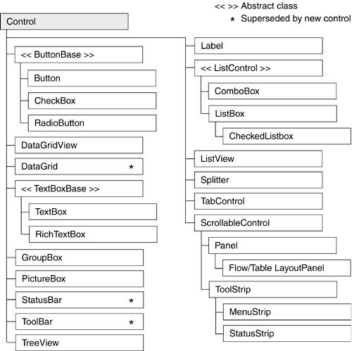
Table 7-1. Selected Windows Forms Controls
Control | Use | Description |
|---|
Button | Fires an event when a mouse click occurs or the Enter or Esc key is pressed. | Represents a button on a form. Its text property determines the caption displayed on the button's surface. |
CheckBox | Permits a user to select one or more options. | Consists of a check box with text or an image beside it. The check box can also be represented as a button by setting:
checkBox1.Appearance =

   Appearance.Button
|
CheckedListBox | Displays list of items. | ListBox with checkbox preceding each item in list. |
ComboBox | Provides TextBox and ListBox functionality. | Hybrid control that consists of a textbox and a drop-down list. It combines properties from both the TextBox and the ListBox. |
DataGridView

GridView
| Manipulates data in a grid format. | The DataGridView is the foremost control to represent relational data. It supports binding to a database. The DataGridView was introduced in .NET 2.0 and supersedes the DataGrid. |
GroupBox | Groups controls. | Use primarily to group radio buttons; it places a border around the controls it contains. |
ImageList | Manages a collection of images. | Container control that holds a collection of images used by other controls such as the ToolStrip, ListView, and TReeView. |
Label | Adds descriptive information to a form. | Text that describes the contents of a control or instructions for using a control or form. |
ListBox | Displays a list of items梠ne or more of which may be selected. | May contain simple text or objects. Its methods, properties, and events allow items to be selected, modified, added, and sorted. |
ListView | Displays items and subitems. | May take a grid format where each row represents a different item and subitems. It also permits items to be displayed as icons. |
MenuStrip | Adds a menu to a form. | Provides a menu and submenu system for a form. It supersedes the MainMenu control. |
Panel

FlowPanelLayout

TablePanelLayout
| Groups controls. | A visible or invisible container that groups controls. Can be made scrollable.
FlowPanelLayout automatically aligns controls vertically or horizontally.
TablePanelLayout aligns controls in a grid. |
PictureBox | Contains a graphic. | Used to hold images in a variety of standard formats. Properties enable images to be positioned and sized within control's borders. |
ProgressBar | Depicts an application's progress. | Displays the familiar progress bar that gives a user feedback regarding the progress of some event such as file copying. |
RadioButton | Permits user to make one choice among a group of options. | Represents a Windows radio button. |
StatusStrip | Provides a set of panels that indicate program status. | Provides a status bar that is used to provide contextual status information about current form activities. |
TextBox | Accepts user input. | Can be designed to accept single- or multi-line input. Properties allow it to mask input for passwords, scroll, set letter casing automatically, and limit contents to read-only. |
TReeView | Displays data as nodes in a tree. | Features include the ability to collapse or expand, add, remove, and copy nodes in a tree. |