|
|
< Day Day Up > |
|
16.6. Building and Using Custom Web ControlsThis section provides an overview of how to write and consume a custom Web control. Its objective is twofold: to introduce the fundamentals of implementing a control and, in the process, provide insight into the architecture of the intrinsic .NET controls. In its simplest form, a custom control is a class that inherits from the System.Web.UI.Control class, implements (overrides) a Render method, and uses its HtmlTextWriter parameter to emit the HTML code that represents the control. Add some public properties to define the control's behavior, and you have a custom control that functions like the built-in ASP.NET controls. More complex controls may require features such as data binding and caching support, which are not covered in this chapter. For a full understanding of those topics, refer to a good ASP.NET book.[1]
A Custom Control ExampleListing 16-10 defines a custom control that we will use to illustrate the basics of control creation. The purpose of this control is to display a large or small version of a company logo, along with the company's name. Two properties determine its appearance and behavior: LogoType takes a value of small or large to indicate the size of the image to be displayed, and Link specifies the URL to navigate to when the small logo is clicked. Listing 16-10. A Custom Control?tt>logocontrol.cs
using System;
using System.Web;
using System.Web.UI;
namespace CompanyControls
{
// (1) Inherit from the System.Web.UI.Control class
public class CompanyLogo : Control
{
// Custom control to display large or small company logo
private string logo_sz; // "small" or "large"
// Page to go to when logo is clicked
private string myLink;
public string LogoType
{
get {return logo_sz;}
set {logo_sz = value;}
}
public string Link
{
get {return myLink;}
set {myLink = value;}
}
// (2) Override the Render method
protected override void Render(HtmlTextWriter output)
{
// (3) Emit HTML to the browser
if (LogoType == "large"){
output.Write("<a href="+Link+">");
output.Write("<img src=./images/logo_big.gif
align=middle border=0>");
output.WriteLine("</a>");
output.Write(" ");
output.Write("<b style=font-style:24;");
output.Write("font-family:arial;color:#333333;>");
output.Write("STC Software</b>");
} else {
output.Write("<a href="+Link+">");
output.Write("<img src=./images/logo_small.gif
align=middle border=0>");
output.WriteLine("</a>");
output.Write<br>");
output.Write("<b style=font-style:12;");
output.Write("font-family:arial;color:#333333;>");
output.Write("Shell Design Studio</b>");
}
}
}
}
Let's examine the three distinguishing features of a custom control class:
//Following yields: <table border=0>

Output.WriteBeginTag("table")

Output.WriteAttribute("border","0");

Output.WriteEndTag("table")
A third approach uses "stack-based" methods to render code. It uses AddAttribute methods to define attributes for a tag that is then created with a RenderBeginTag method call and closed with a RenderEndTag call. Although the approach is verbose, it has the advantage of automatically detecting which version of HTML a browser supports and emitting code for that version. The following code generates the same HTML as is in Listing 16-7 for the large image. It relies on a mixture of HtmlTextWriter methods and special tag, attribute, and style enumerations. Refer to the documentation of HtmlTextWriter for the lengthy list of methods and enumerations.
output.AddAttribute(HtmlTextWriterAttribute.Href,Link);
output.RenderBeginTag(HtmlTextWriterTag.A); // <a
output.AddAttribute(HtmlTextWriterAttribute.Src,bgImg);
output.AddAttribute(HtmlTextWriterAttribute.Align,"middle");
output.AddAttribute(HtmlTextWriterAttribute.Border,"0");
output.RenderBeginTag(HtmlTextWriterTag.Img);
output.RenderEndTag();
output.RenderEndTag(); // </a>
output.Write (" ");
output.AddStyleAttribute(HtmlTextWriterStyle.FontSize,"24");
output.AddStyleAttribute(HtmlTextWriterStyle.FontFamily,"arial");
output.AddStyleAttribute(HtmlTextWriterStyle.Color,"#333333");
output.RenderBeginTag(HtmlTextWriterTag.B);
output.Write("Shell Design Studio");
output.RenderEndTag();
Using a Custom ControlThe key to using a custom control is the @Register directive, which was discussed in Section 16.1. Its Assembly and Namespace attributes identify the assembly and namespace of the custom control. Its TagPrefix attribute notifies the ASP.NET runtime that any tag containing this prefix value refers to the control specified in the directive. Here is a Web page that includes the custom CompanyLogo control: <%@ Page Language="C#" %> <%@ Register Namespace="CompanyControls" TagPrefix="logo" Assembly="logocontrol" %> <script runat="server"> protected void SendPage(object src, EventArgs e) { // Process page here. } </script> <html> <body> <logo:CompanyLogo runat="server" Link="products.aspx" LogoType="large"/> <hr> <font size=2 face=arial color=black><center> This page contains ways to contact us <br> <asp:Button runat="server" text="submit" OnClick="SendPage" /> </body> </html> The control that we have created behaves similarly to the built-in Web controls, but lacks one important feature that they all have: the capability to maintain its state during a postback operation. Control State ManagementLet's change the preceding code to set the LogoType property when the page is first loaded, rather than within the body of the code. We use the IsPostBack property for this purpose:
protected void Page_Load(object src, EventArgs e)

{

   if (!IsPostBack) {

      lgc.LogoType="large";

   }

}
On the initial request, LogoType is set and the page is returned with a large image. However, subsequent postbacks result in the small image being displayed because the value is not retained, and the code defaults to the small image. Recall that state is maintained between postbacks in the hidden _VIEWSTATE field. This field contains the values of the ViewState collection, so the secret to state control is to place values in this collection. It operates like a hash table梐ccepting name/value pairs梐nd is accessible by any control. The following code demonstrates how property values are placed in ViewState as a replacement for the simple fields used in Figure 16-7.
public class CompanyLogo : Control

{

   // Custom control to display large or small company logo

   public CompanyLogo() {

      ViewState["logo_sz"] = "small";

      ViewState["myLink"] = "";

   }

   public string LogoType

   {

      get {return (string) ViewState["logo_sz"]; }

      set {ViewState["logo_sz"]= value;  }

   }

   public string Link

   {

      get {return (string) ViewState["myLink"]; }

      set {ViewState["myLink"]= value;  }

   }

   // Rest of class code is here...
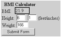
The property values are now maintained in the _VIEWSTATE field and persist between postbacks. Composite ControlsAt the beginning of the chapter, we created a Web page (refer to Figure 16-2) that calculates the Body Mass Index. This calculator consists of text boxes, labels, and a button. To turn this into a custom control, we could take our previous approach and override the Render method with a lengthy list of statements to generate the appropriate HTML. In addition, special code would have to be added to maintain the state of the control during postback operations. A better solution is to create a custom composite control. A composite control is created from existing controls. Its advantage is that these controls, referred to as child controls, are very low maintenance. They render themselves梕liminating the need to override Render梐nd they maintain their state during postbacks. In addition, they let you program with familiar objects and their members, rather than output statements. There are two major differences in the code used for the "from scratch" custom class in our preceding example and that of a composite control:
Listing 16-11 contains the code to implement the BMI calculator as a composite control. The calculator comprises three text boxes, a label to display the result, and a button to invoke a method to perform the calculation. Most of the code of interest is in the overridden CreateChildControls method. It adds the standard controls to the collection, and uses LiteralControl to add HTML and descriptive information that helps format the control. To simplify the listing, code validation is included on only one control. Listing 16-11. A Composite Control?tt>bmicompos.cs
using System;
using System.Web;
using System.Web.UI;
using System.Web.UI.WebControls;
namespace CompositionControls {
public class BMIComposition : Control, INamingContainer {
TextBox htf;
TextBox hti;
TextBox wt;
Label bmi;
private void getBMI(object sender, System.EventArgs e)
{
if (Page.IsValid) {
decimal f = Convert.ToDecimal(htf.Text);
decimal inch = Convert.ToDecimal(hti.Text);
decimal w = Convert.ToDecimal(wt.Text);
decimal totinches = f * 12 + inch;
decimal h2 = totinches * totinches;
decimal massIndex = (w * 703 * 10/ h2)/10;
bmi.Text = massIndex.ToString("##.##");
}
}
protected override void CreateChildControls() {
htf = new TextBox();
hti = new TextBox();
wt = new TextBox();
bmi = new Label();
bmi.Width= 50;
bmi.BorderStyle= BorderStyle.Solid;
bmi.BorderWidth=2;
htf.Width= 30;
hti.Width= 30;
hti.ID = "hti";
wt.Width = 40;
// Display calculator interface
Controls.Add(new LiteralControl
(" <b>BMI Calculator</b>"));
Controls.Add(new LiteralControl
("<br>BMI: "));
Controls.Add(bmi);
Controls.Add(new LiteralControl("<br>Height: "));
Controls.Add(htf);
Controls.Add(new LiteralControl("  "));
Controls.Add(hti);
Controls.Add(new LiteralControl(" (feet/inches)"));
Controls.Add(new LiteralControl("<br>Weight: "));
Controls.Add(wt);
Controls.Add(new LiteralControl("<br>"));
// Validation control for inches accepted
RangeValidator rv = new RangeValidator();
rv.ControlToValidate="hti";
rv.MaximumValue="12";
rv.MinimumValue="0";
rv.Type=ValidationDataType.Integer;
rv.ErrorMessage="Inches must be 1-12";
Controls.Add(rv);
// Button to invoke BMI calculation routine
Button calcBMI = new Button();
calcBMI.Text = "Submit Form";
calcBMI.Click += new EventHandler(this.getBMI);
this.Controls.Add(calcBMI);
}
}
}
Note that getBMI performs the BMI calculation only if the Page.IsValid property is TRue. Include this check when validation controls are used, because server-side validation sets the IsValid flag to false if validation tests fail, but does not prevent code execution. To make the control available, compile it and place it in the \bin directory of the Web page. csc /t:library bmicompos.cs The control is included in a page using the @Register directive as described earlier:
<%@ Register Namespace="CompositionControls" TagPrefix="bmicon"

   Assembly="bmicompos" %>

<HTML>

   <table border=0 color=#cccccc>

   <tr><td>

      <bmicon:BMIComposition runat="server"  />

   </td></tr></table>
Figure 16-16. BMI composite control
|
|
|
< Day Day Up > |
|