11.3 Adding Form Elements
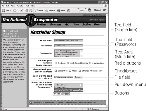
Unless you've never used a computer before, the different user interface elements
available for HTML forms should look familiar: text fields where people can type in
information (their names, addresses, phone numbers, and so on); checkboxes for making
multiple-choice selections; and menus for picking items from a list. The Forms tab
of the Insert bar lets you create all of these elements and more (see Figure 11-2).
11.3.1 What All Form Elements Have in Common
The routine for adding form elements to your document always follows the same
pattern:
In the document window, insert a form (see Section 11.2).
Or, if the page already has a form, click inside its red border.  |
If a text field is the first element of the form, you can skip this step. As soon as you add a form element,
like a field, checkbox, or pop-up menu, to a page that doesn't yet have a form, Dreamweaver asks if you'd
like to add the proper form tag. Click the Yes button, and Dreaweaver automatically creates the red dottedline
form boundaries (and, behind the scenes, the corresponding <form> tags). You should ALWAYS click
the Yes button. A form field that isn't surrounded by the proper form tag won't work.
|
|
Click the appropriate button on the Insert bar (see Figure 11-2).
Alternatively, use the Insert Form submenu. You'll soon discover that every form
object on the Insert bar is also represented by a command on the Insert menu (for
example, InsertForm ObjectsText Field). Form submenu. You'll soon discover that every form
object on the Insert bar is also represented by a command on the Insert menu (for
example, InsertForm ObjectsText Field). |
Instead of just clicking a form-element button on the Insert bar, you may prefer to drag it off the tab
and into a specific position on your Web page. This trick works with any of the user controls on the Insert
bar, not just text fields.
|
|
Type a name for the freshly minted (and still highlighted) form element into the
Property inspector's name box (see Figure 11-5).
Dreamweaver automatically names the field梖or example, it might propose
textfield, textfield1, and so on. It's a good idea, however, to give the field a new,
unique name, because this name will be submitted with the visitor's input as a
name/value pair.
Set the form element's properties.
For example, you may be able to specify its width, height, and other variables. The
following descriptions indicate which options are available.
11.3.2 Text Fields
When you need to collect a specific piece of information like a person's name, phone
number, or address, you'll use a text field (shown in Figure 11-4). Text fields accept
typed responses and are great for open-ended questions. They come in three different
flavors: single-line fields for short responses, password fields to hide user input from
snooping eyes, and multi-line fields for longer typed replies.
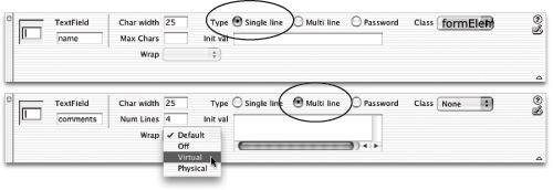
Once you've inserted the text field, you can adjust the following settings in the Property
inspector (see Figure 11-5):
Char Width. The width of a text field is measured in characters; so if you type 20
for the Char Width (character width), the text field will be as wide as necessary to
hold 20 typed letters. Be aware that the exact size can vary from browser to browser.
(You can use Cascading Style Sheets to set an exact width. You'll find an example
of this in the tutorial in Section 11.5.5.) Type. A single line text field, of course, holds just one line of text. This is the most
common kind of text field; use it for collecting small pieces of information, like a
last name, social security number, or credit card number. Multi-line fields provide a larger area for adding multiple lines of text. You'll need
to use this kind of text field when offering a place to type longer comments, such
as in a "Let us know what you think!" or "Nature of problem:" field.
|
Dreamweaver includes a separate button for adding a Multi-line text field梒alled Textarea in HTML
(see Figure 11-2).
|
|
Password fields hide a password being typed from the prying eyes of passing spies.
Whatever your Web visitor types appears as asterisks *** (Windows) or bullets
•••• (Mac) on the screen. (Of course, the information in the password field is still
transmitted as plain text, just like any other form field. The masking action takes
place only in your visitor's browser.) Max Chars/Num Lines. Max Chars (maximum characters) is a text field that
lets you limit the number of characters that it will accept. It's a good way to help
ensure that guests type the right information in the right place. For instance, if
you use a field to collect the age of the visitor, odds are you won't need more than
3 characters to do it; very few 1,000-year-olds surf the Web these days (and those
who do don't like to reveal their ages). When you've specified a Multi-line text field, the Max Chars box morphs into
the Num Line box. In this case, you can't limit the amount of text someone types
into the field. Instead this field lets you specify the height of the text field on the
screen.
NOTE
The limit you specify here affects only how tall the field will be onscreen. Your visitors can type as
many lines of information as they want. (A scroll bar will appear if the typing exceeds the size of the box
you've specified with the Num Lines option.)
Wrap. The often-confusing Wrap property specifies what happens when your
visitor types right to the edge of the text box. (Of course, it applies to Multi-line
text fields only.) The Default value varies from browser to browser; you can't rely on it to produce
consistent results for all visitors. The Off setting prevents sentences from wrapping inside the text field. When the
typed text exceeds the width of the field, a horizontal scroll bar appears at the bottom
of the field, and the text scrolls to the left. The text remains on a single line
until the visitor hits Enter or Return. You'll almost never want to use this option,
because it forces your visitor to scroll not only up and down, but left and right,
too, to see everything she's typed. The last two options create a text field that works like most people would expect:
when the typing reaches the edge of the box, it automatically wraps to the next
line. To your visitor, there's no visual difference between the Virtual and Physical
options; these wrapping styles differ only in the way they format the text when
it's transmitted. The Virtual setting displays line breaks only on the screen, in your visitor's browser;
when the text is actually submitted, it will appear as a single line (unless said visitor
manually inserted line breaks by pressing Enter or Return). If you create the
field using the Physical setting, on the other hand, the browser inserts line breaks
at the end of each line as it wraps. When transmitted, the text maintains these
line breaks. In general, the Virtual setting is the best approach. It doesn't insert artificial line
breaks and maintains the integrity of the typist's input. Init Val. Here, you can specify the Initial Value of the field梥tarter text that automatically
appears in the field, so that it won't be empty when the visitor begins
completing the form. You can use this feature to include explanatory text inside the
field itself, such as "Type your name in this box" or "Example: (212) 555-1212."
|
Can I use the Password field type for credit card numbers
and other sensitive information?
Yes, but it won't give the information any extra security.
The Password field does one thing: it hides user input on the
screen. Someone looking over your visitor's shoulder won't
be able to read what's being typed梚t'll look like a bunch
of dots梑ut once that information is submitted over the
Internet, it's just as visible as a regular text field.
In order to provide real security for forms information, you
need an encrypted connection between the Web server
and the visitor's computer. Most Web site creators use SSL
(Secure Socket Layer) technology for this purpose.
Most Web browsers understand this technology, but your
Web server must be specially configured to work in this
mode. Contact your Web host to see if you can use SSL on
your server (the answer is usually yes). If so, they'll be able
to tell you how to set it up.
|
NOTE
If the page is one of the dynamic file types Dreamweaver works with桝SP, ASP.NET, PHP, Cold Fusion,
or JSP梱ou'll also see a small lightning bolt to the right of this box. This button lets you add dynamic data梚nformation
drawn from a database梩o the text field. (In-depth coverage of this feature starts in Section 23.3.1.)
After you've finished tweaking the text field's properties, don't forget to type a text
label next to the field in your document window to let your site's visitors know what
the text field is for. Short labels like "First Name," "Phone Number," or "Type your
comments here" will do just fine.
11.3.3 Checkboxes
Checkboxes (see Figure 11-4) are simple and to the point; they're either selected or
not. They're great for multiple-choice questions in which your visitor is allowed to
select more than one item in a group. For example, suppose you produce three different
email newsletters that you send out each month. In your form, you might include
some text?Check the boxes for the newsletters you'd like to receive"梐nd three
corresponding checkboxes, so that each visitor can sign up for only the newsletters
he wants.
Once you've added a checkbox to a form, you can set up these options for it in the
Property inspector (Figure 11-6):
|
If you're not careful, creating forms can quickly lead to visual
chaos. The different shapes and sizes of text boxes, radio
buttons, and other form
objects don't naturally align
well with text. One solution:
Use tables to get a handle
on the appearance of your
forms.
In the first picture above,
form elements were added
next to the text on each line,
forcing your eye to follow a
prominent zigzag pattern
created by the form's text
boxes. The result is not only ugly, but also hard to read.
In the second picture, a table made of 2 columns and 13
rows (one row for each question) organizes the text and
form elements into two columns. Notice that the text next to each form element aligns to the right, creating a clean edge
that effectively mirrors the edge created by the form fields.
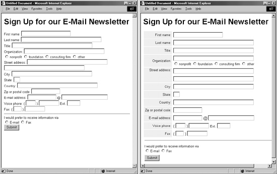
To make this work most effectively,
set each text field
to the same width, using
the Char Width property or
Cascading Style Sheets (see
Section 11.5.5 for an example
of this).
When using this technique,
add the <form> tag first,
insert the table inside the
form's dotted red boundaries,
and then add form
elements inside the table. If you make a table first and then
try to insert a form, Dreamweaver will only let you add it to
a single cell of the table.
See Chapter 7 for more on creating tables.
|
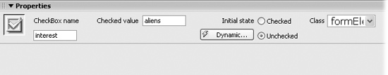
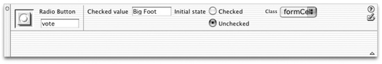
Checked Value. You're specifying here the information that, if your visitor turns
on this checkbox, will be submitted when the form data is sent to your processing
program. It doesn't necessarily have to match the checkbox's label (which you'll
create in a subsequent step); it could, instead, transmit some special coded response
to your processing application. Your visitors will never actually see this information. Initial State. If you like, your checkbox can be already checked when your Web
page first appears. You may have seen this setup on sites that require you to sign
up for some service. Usually there's a checkbox梐lready checked梔own near the
bottom of the form, with fine print like this: "Check here if you want to get daily,
unsolicited email from our marketing department."
NOTE
As with many form elements, your checkbox can respond to information it retrieves from a database.
The Dynamic button on the Property inspector梠nly available when you're working on a dynamic page (ASP,
PHP, and so on)條ets you set the checkbox state (Checked or Unchecked) based on data in a database.
(See Section 23.3.1 for details.)
After adjusting the Property inspector, don't forget to return to the document window
to add a text label next to the field. Let people know what the checkbox is for: "Yes, sign
me up!" for example. Finally, you may want to insert another checkbox. Checkboxes
don't have to come in groups, but they often do.
11.3.4 Radio Buttons and Radio Groups
Radio buttons, like checkboxes, are very simple (see Figure 11-4); they're either selected
(represented on screen as a solid circle) or not (an empty circle).
But unlike checkboxes, radio buttons restrict your visitor to making only one choice
from a group, just like the radio buttons on an old-style automobile dashboard (or, if
you're too young to remember those car radios, like the buttons on a blender). Radio
buttons are ideal for multiple-choice questions. For example, "What is your income:
A. $10-35,000, B. $35-70,000, C. $70-100,000, D. None of your business."
You can set up these options for a radio button in the Property inspector (Figure
11-7):
Checked Value. This is the information that the form will submit when your visitor
selects this button. Once again, it doesn't necessarily have to match the radio
button's onscreen label. Initial State. Often, when a form page first loads, one radio button in each set is
preselected. To do your visitors this timesaving courtesy, turn on Checked for the
button that holds the default value梩he one they'll choose most often. Of course, if making a choice here is optional, then you can leave all of the buttons
unselected by setting their initial states to Unchecked. However, once somebody
does select a radio button, only the Reset button can make them all unselected
again (see Section 11.3.7 for information on creating a Reset button).
Radio buttons come in groups; only one button in the group can be selected at the
same time. To achieve this effect, every button in the same group shares the same
name (although they should have different Checked values). If, when testing your
page, you notice that you can select more than one radio button at a time, you must
have given them different names. (Consider using Dreamweaver's Radio Group object,
described next. It acts as a wizard that simplifies the process of creating a group
of radio buttons.)
The final step in creating radio buttons is to add text labels for the entire group and
each button. Simply click in the document window and type, just as you'd add any
text to the page. Your whole-group-of-buttons label may take the form of a question
("How would you like to pay?"); the labels for the individual buttons might say, for
example, "Visa," "MasterCard," and "I.O.U."
11.3.4.1 Radio Group.
Although creating a group of radio buttons using the Radio Button object is easy,
Dreamweaver MX includes the Radio Group object to make it even simpler. The Radio
Group object provides a single dialog box for creating a group of radio buttons and
their labels in one fell swoop. To use it:
On the Insert bar, click the Radio Group button (see Figure 11-8).
The Radio Group window appears. Type a name in the Name field.
This name covers all radio buttons in the group, saving you the trouble of typing
the name for each button yourself. In the Label column, click on the top Radio label. Type a label for the first button.
This label will appear next to the button onscreen. Hit the tab key to jump to the Value column for that button and type a value for
the first button.
This is the "checked value" of the button. Type what you want to be passed to the
Web server when somebody selects this button and submits the form.
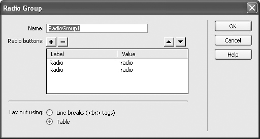
Repeat steps 3 and 4 for the second button in the group.
You can create additional radio buttons by clicking the + button. Follow steps 3
and 4 for each additional button you add in this way. Select a layout option for the group.
Dreamweaver puts each radio button in the group on its own line. You can choose
whether Dreamweaver uses a line break (<br> tag) to separate each line, or whether
it uses a table梠ne radio button per row. Don't care for either of these options? Pick one anyway. You can always redesign
the layout later. Click OK to add the radio group to your page.
The radio buttons and their labels are essentially text and buttons on the screen.
You can move the buttons around, change their labels, and alter each button's
properties in the Property inspector.
11.3.5 Pull-down Menus and Lists
While checkboxes and radio buttons both provide ways to offer multiple choices, you
should consider them only when there are relatively few choices. A form can quickly
become overcrowded with buttons and boxes if there are too many options to choose
from. The beauty of lists and pull-down menus (usually called pop-up menus on the
Macintosh) is that they offer many choices without taking up a lot of screen space.
(Figure 11-9 shows an example.)
Once you've inserted a menu or list object onto your document window, here's how
to adjust the Property inspector settings:
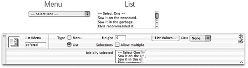
Height. A list can be a single line tall (in which case you may as well use a menu),
or many lines (allowing your visitors to see a number of choices at once). The
number you type into the Height box (available for lists only) should reflect the
amount of space you wish the list to take up on the page. A vertical scroll bar will
appear automatically if the height you specify here is smaller than the number of
items in the list. Allow multiple. Here's a key difference between menus and lists: If you turn on
this option, a visitor can select more than one item from a list, just by pressing the
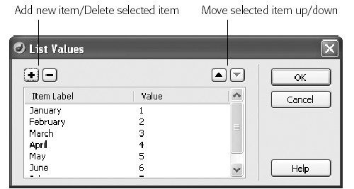
Ctrl ( ) key while clicking different options in the list. ) key while clicking different options in the list. List Values. This button opens the List Values dialog box (see Figure 11-10), where
you build the list of options in your list or menu. Each item is composed of two
parts: a label (the text that actually appears in the menu or list on the Web page),
and the value (the information that gets submitted with the form, which isn't
necessarily the same thing as the label). To use this dialog box, type an item label. Press Tab (or click in the Value column)
and then type the value, if you like. (See Figure 11-10 for details.) Including a value is optional; if you don't specify one, your form will submit the
item's label as the value. Still, setting up a separate value is often useful. Imagine
that you've designed a pull-down menu on an ecommerce site, so that your visitors
can select the month of their credit card's expiration. Figure 11-10 shows what
the items for such a pull-down menu might look like: The names of the months
would appear on the menu, but when a visitor selects, say, April, the number 4 is
what the form actually transmits to your form-processing program. Since computer programs are often more comfortable with numbers than names?
and humans often the exact opposite梚t makes more sense to use numbers for
list values in this case. Another example: When offering your visitors a pop-up menu of products from
which to choose, the label might be the human-friendly name of the product, like
"Blue Wool Cap." The value would be the model number that your form-processing
program can understand, like XSD1278.
Dynamic values. Dreamweaver MX can also create a dynamic menu, where the
labels and values of the menu come from a database. This option梐vailable only
when you insert a menu into one of the dynamic page types described in Part VI
of this book梚s great when the menu items change frequently, as they would in
a list of employee names, for example. This feature is described in Section 23.3.3.
Click OK when you're finished building your menu or list. You can always return to
this screen and edit the list of options. To do so, click the menu or list in the document
window and then click the List Values button on the Property inspector. You return
to the dialog box shown in Figure 11-10.
As with other form elements, you can, and probably should, add some explanatory
text alongside the list or menu in the document window.
11.3.6 File Field
Receiving responses to checkboxes, radio buttons, and pull-down menus is all well and
good, but what if you'd like your visitors to submit something a little more meaty條ike
an entire file? Imagine a bulletin-board system, for example, that would allow guests
to post JPEG images of themselves, or upload word processing documents to share
with others. They can do just that, thanks to the File Field field (see Figure 11-2)梐nd
a little magic from your Web server.
Before you get carried away with the possibilities the File Field offers, you'll need to do
a little research to see whether you can use it on your Web site. Although Dreamweaver
makes it easy to add a field for uploading image files, text files, and other documents,
you'll need to check with the administrator of your Web server to see if anonymous file uploads are permitted (some servers don't allow this kind of activity for fear of
receiving viruses or overly large files). Then, of course, you'll have to ensure that the
program that processes the form is programmed to do something with the incoming
file梥tore it somewhere on the server, for instance.
When you click the File Field button on the Insert bar (or choose InsertForm Objects
File Field), Dreamweaver inserts a text field and a Browse button; together, they
constitute a single File Field. When you click either one, you highlight both.
The Browse button, once it's posted on the Web and visible in somebody's browser,
opens up the standard Windows or Macintosh Open File dialog box, permitting your
visitor to navigate to and select a file for uploading.
The Property inspector offers only two settings to change (other than specifying a
more creative name):
Char Width. The width of a text field is measured in characters; if you type 20 for
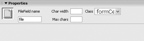
the character width, the field will be 20 characters wide. Max Char. Leave this blank, as shown in Figure 11-11.
Your File Field isn't finished until you've added a label to it in the document window,
something like "Click the Browse button to select a file for uploading."
|
Imagine adding a "Job Application" page to your site, where
applicants could upload their resumes for review. Or a
Web-based way for clients to submit their graphic files and
word-processing documents.
Dreamweaver lets you add a File Field to a form, but doesn't
provide the tools to make this useful feature function on
your Web site. To compensate for that glaring omission,
there are extensions that add this missing power to Dreamweaver
MX 2004. On the free side, there's the PHP Upload
Extension from Sephiroth (
www.sephiroth.it/download.php?category=PHP
), which adds basic upload abilities to
PHP sites, and WWWebconcepts ASP.NET Upload (
www.ebconcepts.com/asp/dwmx_extensions.asp
) for the .NET
server model. (See Chapter 21 for a discussion of dynamic
sites and server models.) For ultimate control, including the
ability to rename duplicate files and add file information
to databases, DMXZone (
www.dmxzone.com
) offers three
commercial extensions for ASP, ASP.NET, and PHP. The Pure
Upload extension offers many different settings to manage
the process of uploading files to a Web site.
|
11.3.7 Hidden Field
Most form elements are designed to accommodate interaction from your visitors:
clicking radio buttons, typing into text fields, and making choices from menus, for
example. But there's one kind of field that your visitors won't even know about and
will never see: the hidden field.
Why, you're probably asking, would you need to submit a value you already know?
Hidden fields are intended to supply information to the programs that process
forms梚nformation that the program has no other way of knowing. For example,
most Web hosting services offer a generic form-processing program that collects
information submitted with a form and emails it to a selected person. But how does
the program know who to email the data to? After all, it's a generic program that's used
by hundreds of other people. The solution: a hidden field that stores the information
required for the program to properly process the form?span class="docEmphasis">email=me@mydomain.com,
for example.
To insert a hidden field, click the Hidden Field button on the Insert bar, or choose
InsertFormHidden Field. A gold shield icon appears on the page (this is Dreamweaver's
symbol for HTML, which won't be visible in Web browsers). Use the Property
inspector to give the field a name and a value梩hat is, the value that will get submitted
to your form-processing program (in example above, your email address).
NOTE
The gold shield indicating a hidden field appears only if the Hidden Form Fields box is turned on in
the Invisible Elements category of the Preferences window (Section 1.3.5) and if Invisible Elements is turned on
in the View menu (ViewVisual AidsInvisible Elements).
11.3.8 Buttons
No form is complete without a Submit button for your Web visitors to click as a fi-
nal step (see Figure 11-2). Only then do their responses set out on their way to your
form-processing application. Another button worth including is a Reset button, which
your visitors can click when they've filled out a form and realize they've made an
error. The Reset button clears all of the form entries and resets all of the form fields
to their original values.
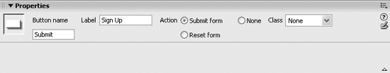
The Property inspector controls (Figure 11-12) for a freshly inserted button are:
Label field. The label is the name that appears on the button. Dreamweaver proposes
Submit, but you're free to substitute Do It, Make It So, or Send my data on
its merry way. For buttons, the label is the value that will be submitted like other form data; that's
why there's no separate Value field on the Property inspector. This quirk opens
up some interesting possibilities. You could, for example, include several Submit
buttons, each with a different label. Maybe you're creating a form for a database
application; one button might say Delete, while another says Edit. Depending on
which button your visitor clicks, the program processing the form would either
delete the record from the database or modify it. Action. These three buttons govern what happens when somebody clicks your
button. A Submit button transmits the form data over the Internet to the formprocessing
program. A Reset form button sets all the fields back to their original
values. (This doesn't mean that the fields, checkboxes, or menu items are left blank,
unchecked, or unselected. Instead, they return to their initial values, which you
specified when creating these various controls. For example, if you set the Initial
State property of a checkbox to Checked, and your visitor unchecks the box and
then clicks the Reset button, a checkmark will reappear in the box.) Setting the button's action to None means that clicking on the button has no effect
on the form. "Gee that's useful," you're probably thinking. But although the button doesn't submit the data or reset the form's fields, you'll
need to choose the None option if you want to add interactivity to the button using
Dreamweaver's built-in Behaviors (see the next chapter). In this way, you can use
a common user interface element梩he 3-D beveled look of a form button梩o
trigger any of many different actions, like opening a new browser window, starting
or stopping a Flash movie, or popping up a message on the screen. If you're a
JavaScript programmer, you can use the button to activate your own programs.
11.3.9 Labels and Fieldsets
Two additional form items appear on the Insert bar: Labels and Fieldsets. Unfortunately,
neither are intended to work with Dreamweaver's Design view. They're
essentially just shortcuts for entering code into Code view.
11.3.9.1 The Label tag
The Label tag lets you associate a label with a particular form element梐 checkbox
or text field, for example. Of course, you can always do that by placing plain text next
to a form element on the page. But because a Label tag is "attached" to a particular
form element, it's more helpful in explaining the function and layout of your form to
people who use assistive technologies like screen-reading software for the blind.
To use the label tag, select a form element梒heckbox, text field, or whatever梐nd
click the Label button in the Forms tab of the Insert bar (see Figure 11-2). You've just
wrapped the form field in a <label> tag. Now, in Code view (Chapter 10), type text
within the tag on either side of the form field like this:
<label>Please type a password: <input name="password"

type="text" id="password"></label>
|
You can find more information on the <label> tag and how to use it with Dreamweaver's built-in HTML
reference. Chose WindowReference to open the Reference panel. Then select Label from the Tag menu
to see a detailed discussion and sample usage for this tag. (If you selected a <label> tag on the page before
opening the Reference panel, the panel will automatically display information about the tag.)
|
|
11.3.9.2 The Fieldset tag
The Fieldset tag is another form-organization tool, this time intended to let you group
related form fields. For example, if you're creating an online ordering form, you can
organize all of the "ship to" information梐ddress, city, state, zip, and so on梚nto
a single set. Again, this arrangement can help those using assistive technology to
understand the organization and intent of a form.
|
I don't want to store form submissions in a database or
anything fancy like that. I just want to receive an email
with the information from each form submitted on my site.
How do I do that?
This common function梐vailable on countless Web
sites梞ay seem like an easy task, but Dreamweaver doesn't
supply a tool for automating the process. Basically, you need
a program to collect the data and send it off in an email.
Most Web hosting companies provide just such programs.
They generally work like this: you build a form, set the
form's Action property (Section 11.2) to point to the URL of the
form-emailing program, and add one or more hidden fields.
The hidden fields contain information for the program to
use梥uch as the email address the results should go to and
the page the visitor should end up at after he submits the
form. Since this form-emailing program varies from server
to server, you need to contact your Web hosting company
for details.
There are, however, a few free extensions, and some
commercial ones, that let you set up this emailing scheme
without leaving the friendly confines of Dreamweaver.
On the free side, check out Kaosweaver Kaosmail (
www.kaosweaver.com/extensions/details.php?id=29&cid=3
),
which works on Unix Web servers and some Windows
servers. Dan Short's SOS Basic CDO Emailer (
www.dwfaq.com/Store/detail/?id=wsBasicCDO
) offers similar features
for Windows Web servers.
There are also many commercial extensions. For basic
form mailing, the Mail Form extension for ASP and PHP is
available from Felix One (
www.felixone.it/extensions/dwextensionsen.
asp
). Two other extensions offer much more
advanced emailing features, including the ability to mass
email newsletters to email addresses stored in a database:
WA Universal Email from WebAssist (
www.webassist.com
)
works for ASP and Cold Fusion pages, and DMXZone (
www.dmxzone.com
) sells both an ASP and PHP version of its
Smart Mailer extension.
|
In many of the latest browsers, the Fieldset tag also has a visual benefit. Internet
Explorer 4 and above, Navigator 6 and other newer browsers display an attractive
border around fieldsets and add a useful label to identify the fields.
To use this tag, select the related form fields. They must be next to each other on
screen, and can be organized within other HTML elements like a table. Then click
the Fieldset button on the Insert bar (see Figure 11-2). Type a label for the fieldset in
the Label window that appears, and then click OK.
You won't see much of an effect in Dreamweaver梛ust the new label you typed. So
preview the page (F12) in a recent version of Internet Explorer, Mozilla, Opera, or Safari
to see the both the label and a border surrounding the form elements in the set.
|