|
|
< Day Day Up > |
|
6.7 Style PropertiesCascading Style Sheets are a powerful and complex technology, providing many more
formatting options than HTML alone. In fact, Dreamweaver lets you set 67 different
CSS properties using the Style Definition window. The following pages cover each of
the eight Style Definition categories and the properties available from each. (If you'd
prefer an online reference, don't miss the built-in CSS reference available from the
Window
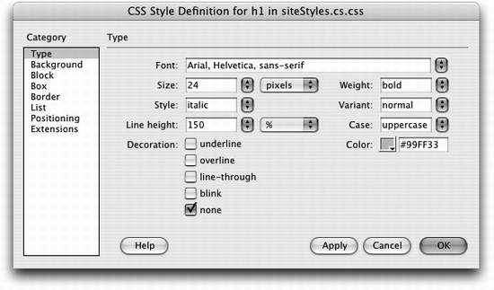
6.7.1 Type PropertiesAs the name implies, the Type category of the Style Definition window lets you set formatting options that affect text (see Figure 6-15).
The numeric values 100-900 are intended to work with fonts that have many different weights (ultrathin, thin, light, extra bold, and so on). 400 is normal; 700 is the same as bold. However, in today's browsers, you'll notice no difference between the values 100-500, and only slight changes in the thickness of the type at each higher level. The 900 option results in extra bold.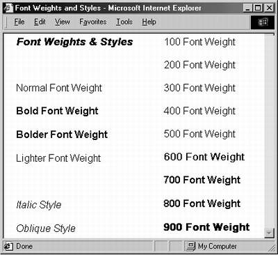
Control the space between lines with the Line Height property. In this example, each paragraph's text is set in 14-pixel Arial. With CSS, you can make lines bump into each other by setting a low line height value (2nd paragraph from top), or spread them far apart by using a larger value (3rd paragraph from top).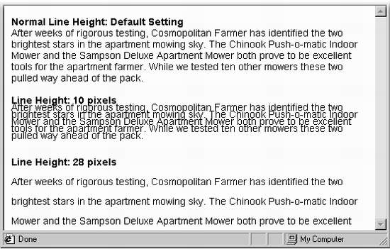
6.7.2 Background PropertiesWhile you're probably familiar with changing the background colors of Web pages, tables, and table cells, Cascading Style Sheets provide even more options for adding colors and images to the backgrounds of your styles (see Figure 6-18). The Background category of Cascading Style Sheet properties lets you specify a background color for a style and control the placement of background images. The "Fixed" option for the Attachment property is not displayed within Dreamweaver, so to get an accurate view of this property, you need to preview it in a Web browser.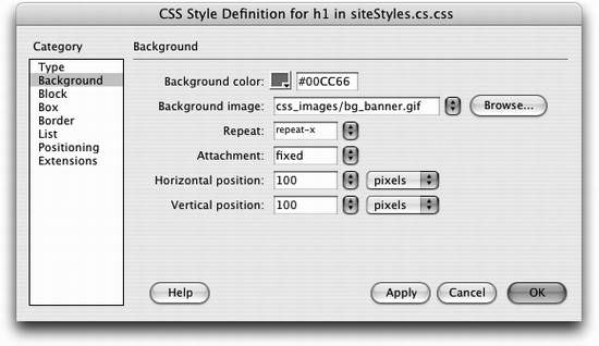
6.7.2.1 Background ColorAny object can have a background color: a single word, a paragraph, or the Web page itself. Using this color box, you can redefine the <td> (table cell) tag, for example, using a light blue background color (every table cell on the page gets filled with that light blue color). 6.7.2.2 Background ImageAdd a background image to the style by clicking the Browse button and selecting an image from your site. You can also type an absolute URL, starting with http://, to use an image off the Web. (Remember that Dreamweaver can't display images specified with an absolute URL. You'll have to preview the page in a Web browser connected to the Internet to see the effect.) To fill your entire page background with some repeating graphic, you could either redefine the <body> tag using this property, or create a class style with a Background Image property and apply it to the <body> tag as described on Section 6.3.2. You can even control how the image tiles (repeats) and where it's placed on the page (see below). Furthermore, you can add background images to any individual element on your page: paragraphs, tables, layers, and so on. NOTE
One common byte-saving technique is to create an image that looks like a button; use it for the background image of navigation links on a page. The links themselves include text?Home," "About Us," and so on梑ut the background of each link looks like a graphical button. The main benefit of this technique is that you don't need to create separate graphics for each button. 6.7.2.3 RepeatBackground images梐s the background of either a page (Section 1.3.3) or of a table (Section 7.6.3)梟ormally fill the available space by tiling (that is, repeating over and over again) across and down. A small image of a carrot added to the background of a page, for example, appears as a field of carrots梠ne next to each other, row after row. But with CSS, you can control how the background image repeats. You can select from the following options:
6.7.2.4 AttachmentBy default, the background image on a page scrolls with the rest of the page, so that as you scroll to read a long Web page, the image scrolls along with the text. But using CSS, you can lock the image in place by choosing fixed from the Attachment menu. For example, say you added your company's logo to the background of a page and set the Repeat property (described above) to no-repeat. The logo now appears only once in the upper-left corner of the page. If you use the fixed option for this property, when a visitor scrolls the page, the logo remains fixed in the upper left corner. (Choosing scroll from the Attachment menu means, of course, that the background image will scroll with the page.) NOTE
The fixed setting doesn't work in Netscape 4, and causes strange screen behavior for Internet Explorer 5.1 for Mac. 6.7.2.5 Horizontal and Vertical PositionUsing these controls, you can specify a position for the affected text or other Web page element. The Horizontal position options are: left, center, right, and (value), which requires you to type an exact number in the box and select a unit of measurement from the menu to the right. Similarly, the Vertical position options include top, center, bottom, and (value). These positioning options refer to the position of the styled object. For example, suppose you created a class style that included a background image with horizontal and vertical position both set to center. Then you applied that class style to a paragraph. The background image would appear in the center of that paragraph, not in the center of the Web page (see Figure 6-19). Background images aren't just for the body of a Web page. You can apply styles that include background images to any selection, even a paragraph of text. Here, a class style with a background image is set to no-repeat (the image won't tile) and to center horizontally and vertically. The style was applied to the body of the page, resulting in the graphic appearing smack dab in the middle of the window. Meanwhile, the same style was applied to a paragraph; this time, the image floats right in the middle of the paragraph.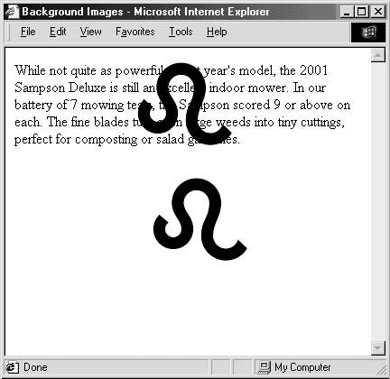
Likewise, if you set the horizontal position of the image to 10 pixels and the vertical position to 20 pixels, the image would start 10 pixels from the left edge of the paragraph and 20 pixels from the top edge. And if you wanted to place an image in the exact middle of the page, you'd choose center from both the Horizontal and Vertical Position menus; set the Repeat property to no-repeat; and apply this style to the page's <body> tag (see Figure 6-19). 6.7.3 Block PropertiesThe Block Properties panel is a hodge-podge of CSS settings that affect how letters and words are displayed (see Figure 6-20). The Block Style properties category is an eclectic mix consisting mostly of text styles. However, the Display property can be used on images, tables, and any other selection or HTML tag. Although the list is long, most of these options don't work in today's browsers.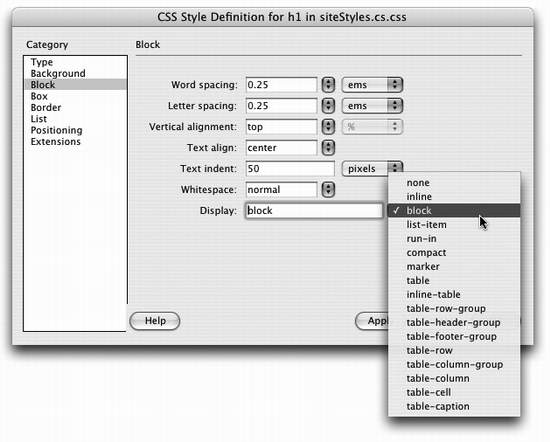
Despite this category's name, these properties don't just apply to block-level elements (paragraphs, headlines, and so on). You can apply a style with these properties to even a single word or two. (The one exception is the Text Align property, which can apply only to paragraphs and other block-level elements.)
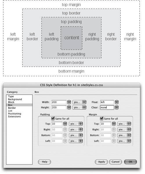
6.7.4 Box PropertiesCSS lets you control the space that appears around any affected Web page element. You work with those properties in the Box category of the CSS Style Definition window (see Figure 6-21).
NOTE
The Float property has many uses, from aligning images to the right or left side of the page to creating drop caps and thumbnail photo galleries. For an excellent introduction and set of tutorials on this subject, visit css.maxdesign.com.au/floatutorial/ .
Top: In the CSS Box Model, every style is
composed of multiple boxes, one inside
the other. Each box controls certain display
properties of the style. For example, the
outermost box of a style is called the
margin. It controls the space between the
border of the style and any other objects
around the styled object such as images,
paragraphs, or tables.
|
|
Only a few elements can have borders in HTML: tables, images, and cells. With CSS, however, you can add a border to any object from an image to a paragraph to a single exclamation point (see Figure 6-22). Even better, you can control each side of the border independently with its own width and color settings, or even turn off some parts of the border.
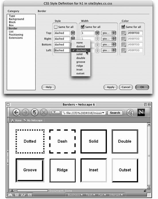
Style. This menu lets you specify the type of line used for the border. Dreamweaver gives you more options than a frame shop: none (the default choice), dotted, dashed, solid, double, groove, ridge, inset, and outset. You can use a different style for each edge, or select a style from the top menu and turn on the "Same for all" box to apply the same style to all four borders. (Bear in mind that Dreamweaver itself can't display these styles. It always shows a solid border. You'll have to preview the page in a Web browser to see the effect.)
Border Widths. You can set the border around each side of a styled object separately. Choose one of the preset widths?span class="docEmphBold">thin, medium, thick, or auto梠r, if you choose (value) from the pop-up menu, you can type a value into the Width box and select a unit of measurement from the pop-up menu to the right. Again, you can choose from a wide range of types: pixels, percentage, inches, and so on. If you want to eliminate the border on one side, type 0 into the appropriate box.
Border Colors. You can color each of the four borders individually using the ubiquitous Dreamweaver color box (Section 1.3.3). If you don't assign any colors, but do assign border widths, Dreamweaver makes the borders black.
NOTE
You have to select a style from the pop-up menu to see the borders. If you leave this option blank or select "none," you won't see the borders even if you set the width and color.
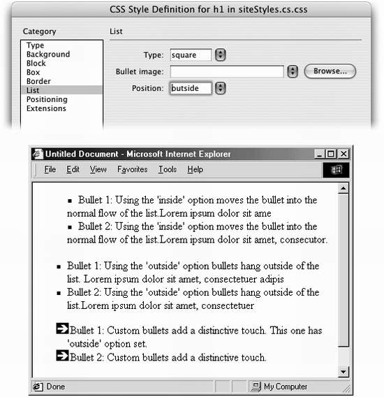
To exercise greater control over bulleted and numbered lists, use the CSS options on the List panel of the Style Definition window (see Figure 6-23).
Type. Select the type of bullet to be used in front of a list item. Options include: disc, circle, square, decimal (1., 2., 3.), lower-roman (i, ii, iii), upper-roman (I, II, III), lower-alpha (a, b, c), upper-alpha (A, B, C), and none (no bullet at all).
Bullet Image. For the ultimate control of your bullet icon, skip the boring options preprogrammed into a Web browser (like disc, circle, square, or decimal) and supply your own. Click the Browse button and select a graphics file from your site folder. Make sure the graphic is appropriate bullet material: in other words, small.
Position. This property controls how the bullet is placed relative to the list item's text. The outside option places the bullet outside of the margin of the text, exactly the way bulleted lists normally appear on a Web page. Inside, on the other hand, displays the bullet within the text margin, so that the left edge of the bullet aligns with the left margin; Figure 6-23 should make the effect clearer.
Cascading Style Sheets may be useful for formatting text and adding background colors and margins to objects, but this technology is also intended as a structural aid for laying out Web pages. You'll learn about these properties and how to set them on Section 8.3.1.
The final category in the Style Definition window is listed last for a good reason: not all Web browsers support them properly.
Page Break. This property specifies, when your visitor makes a printout of your page, whether a page breaks before or after the styled object. You could apply this, for example, to the <h1> tag in order to make sure each printed page begins with a Heading 1 paragraph.
Cursor. Of all the Extension properties, this one holds the most promise. When a visitor moves the mouse over an object with this style applied, this property changes the cursor shape to one of fifteen different designs (a hand, an hourglass, or a crosshair, for example). Internet Explorer 4 and above, Netscape Navigator 6 and above, Mozilla, and Opera 5 and above all recognize this professional-looking property.
Filter. The Filter property can apply many interesting visual effects to a page; the Filter property, for example, can add a drop shadow to an image. Unfortunately, this Microsoft-only option works in the Windows version of Internet Explorer, and no other browsers.
|
|
< Day Day Up > |
|
 Reference command; it's described more completely on